Wednesday, July 23, 2008

You Just Can't Make This Stuff Up

It is easier than ever to be a cartoonist. Your material almost writes itself. You don't have to sweat over trying to find things that are funny when the world just serves up such great material every day. In the daily "pain at the pump" another small bit of social upheaval provides us with amazing satirical humor. But, you just can't make this stuff up, because reality is a much better author.


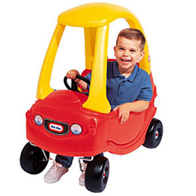
The "Little Tikes" roadster. A bright red "fleet of foot" driveway cruising machine. Every kid's dream car, the envy of the neighborhood.


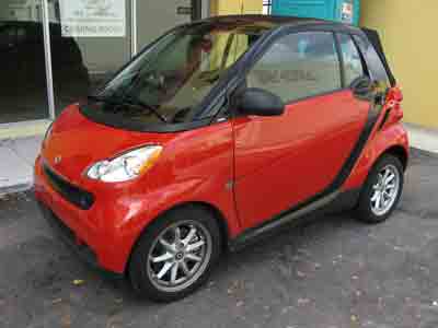
Who knew that years later "Little Tikes" would be making our "real" car? Thank goodness this one uses electricity for power, because with the price of sneakers these days we couldn't afford doing much
cruising.


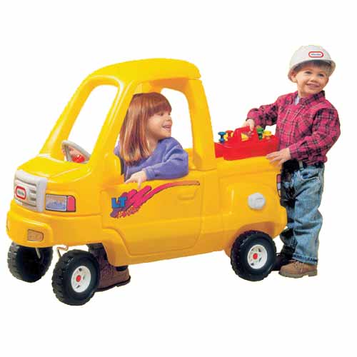
It sure was fun to pretend to go to work and wear that cool hard hat. And the cutie next door had this great truck. Those were the days.

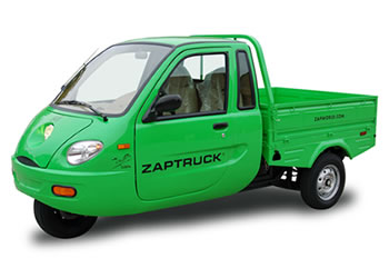
Now you not only get to wear a hard hat to your new "green" job installing solar panels on roof tops. You also get to drive there in a cool little green truck.


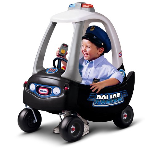
We also loved to play cops and robbers when we were kids. Some of us were the "good guys" and some of us were the "bad guys". It was lots of fun. We didn't yet understand that they were both the same people in real life called politicians.


Today's police cruiser is electric powered too. Although I'm not sure why they need cars with most of the criminals staying home and using the Internet to steal our identities.


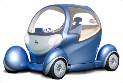
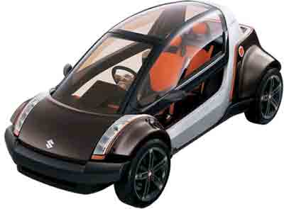
Here is the latest in transportation styling the "submersible reversible". It's designed to get you to work on weekdays and let you explore the bottom of the ocean on your weekends.


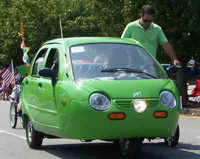
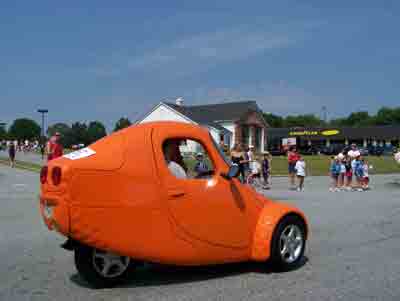
This 'vision of the future' was in this years 4th of July parade following behind a banner that read "Energy Independence Now!" The guy walking next to it was the emergency power source. His job was to push it if the Energizer Bunny gave out.


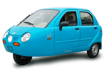
Another example of "Energy Independence Now!" during the 4th of July parade. During the Cold War years in the 1950's thru the '80s we were shown pictures of cars like this as examples of the poverty and failure resulting from communist socialism in the USSR. They were in stark contrast to our American luxury cars. Of course we won the cold war so now to the victors go the spoils.


A famous line from the French Revolution in response to the people starving for lack of bread to eat was "let them eat cake". So it was inevitable that some caring politician's response to our getting poorer daily paying for high priced foreign oil with dollars that keep shrinking in value would be "let them drive clown cars".


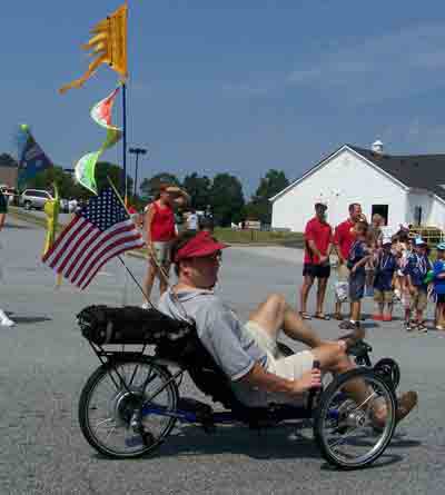
Finally the solution to all our domestic problems. We can be free of foreign oil and cure obesity as we pedal ourselves to the Burger King for a Deluxe Triple Stacked Bacon Cheese Burger Meal...Super-sized.


Keep smiling fellow cartoonists, you can't make this stuff up. We don't have to create humor; we just have to chronicle the world as it is, which is a constant source of amusement for all.

Labels: , ,

Sunday, July 13, 2008

Inside Sequential Comic Strips - Part 2

If you have been following along as I have been sharing my thoughts on the development of my own personal comic strip project, I have talked about the number and the relative size of the panels in a sequential comic strip and how they are used to provide pacing and timing in visual storytelling. Inside Sequential Comic Strips - Part 1

In this installment, I want to explore some other aspects of the classic comic strip, Walt Kelly's Pogo, in order to talk about some of the other tools and techniques that are often missing from usage in many of today's comics. These tools and techniques, like the use of panel variations for timing and pacing, are subtle ways for the cartoonist to enhance their strip and storytelling.


(fig. 1)

In fig. 1 above we get a great example of how the use of different font types can be applied to provide an additional form of personality and characterization. The vulture, a great bit of
stereotypical casting himself, has a very unique and formal speech font that tells us as readers something more about this character's "voice". You also have to love Kelly's delicious way of naming characters, like a mortician named Sarcophagus Mac Abre.

Then we also see that the character Deacon Mushrat (instead of Muskrat, accent on the mush) has his own characteristic speech font. A very nice "Old English Script" that tells us that his voice is full of self righteousness and pomposity. Additionally notice how Kelly shaped the Deacons speech bubbles to add to his "straight laced" and "sanctimonious" tone of speech. And also notice how Kelly creates a special very ominous speech bubble style for
Sarcophagus Mac Abre. Subtle little ways of accenting these characters that would be lost if they just "spoke" in ordinary fonts and balloons.


(fig. 2)

In fig. 2, we see another classic example of character specific speech fonts. This time for P. T. Bridgeport (named for the famous showman P. T. Barnum of circus fame) we see that his "voice" is a constant show in itself. His every phrase is a spectacle of colossal magnitude. Again when P.T. speaks we as readers know so much more about the character and his personality because of Kelly's use of a unique font style.


(fig. 3)

In fig. 3 we get an example of not only the usage of a character specific font type for the Deacon, but we also get to see Kelly's characteristic usage of font boldness as a means to focus his readers on specific words or phrases in a character's speech. An interesting side note is that because of the often political and social commentary involved in Pogo, there were extensive studies made by "government intelligence" organizations (an oxymoron in itself) to try to determine if the bold type words formed some sort of subversive code. If they had just understood the purpose of the cartooning technique they would have realized that Kelly was just wanting to make sure that his readers weren't missing out on the word play and all the subtle implications of his use of specific words and their implied meanings beyond their context as a character spoke. For example the term "Jack Acid" was actually referring to a bunch of "jack asses" which was Kelly's satirical dig at the John Birch Society. And his word play about combining acids and bases producing "salty doings" was expressing his perception of the society's ultra conservative right wing views. All leading to the gag in the third panel about their thinking being "off base and half assed". Kelly had some strong ideas and opinions embedded in these strips and he used the bold type to make sure the accents were not lost.


(fig. 4)

In fig. 4, we see another example of Kelly's use of bold type for accents. It is important to note that this technique wasn't just used to highlight important word play and implied meanings, as seen in fig. 3, but it was also Kelly's method of providing a comedic timing and rhythm to his comic strip. Much like a stand-up comic uses phrasing and beats to set up and deliver their monologue, Kelly was using bold type to punctuate and time his gags.

Again by studying the work of Walt Kelly we can learn more about the techniques and tools of creating masterful and highly entertaining sequential comic strips. Today's cartoonist has the opportunity to revive these techniques and apply them as part of their craft.

Labels: ,

Wednesday, June 25, 2008

Inside Sequential Comic Strips - Part 1

The classical newspaper comic strip is a form of sequential art. This particular cartooning form has undergone some changes over the years and some historical perspective can be quite revealing. It is interesting how things follow a cause and effect relationship, and even more interesting how policies can be implemented that create constraints that continue to exist even though the reason the policy was instituted has vanished. For newspaper comic strips this seems to be the case. Over time beginning in the late 70’s, newspapers began to reduce the space available for comic strips. They slowly began to squeeze the comics into an increasingly smaller amount of space. The first step was to cut the daily comic’s section from two pages down to one and a half pages and then down to a single page. This had the effect of killing off many good comic strips by reducing the number of strips that a paper would continue to publish. Shortly there after, the individual “footprint”, available space on the page, of each remaining strip got the big squeeze and four panel strips pretty much were forced down to three panels. Additionally this print size reduction made it increasingly difficult for the cartoonists to maintain their desired level of visual detail in their work.

This policy shift toward marginalizing comic strips in newspapers caused two resulting effects. First, it greatly tightened the field of opportunity for cartoonists to draw comic strips, less space meant papers bought fewer strips so drawing a comic strip became less accessible as a career. Second, smaller “footprints” forced cartoonists to move toward simpler more graphically stylized cartoons with minimal layouts. There was less white space, so there had to be less visual information in each panel. The age of the “clip art” comic strip was born.

Then along came the Internet and a whole new distribution medium for the sequential comic strip was born. This made self publishing possible and created new opportunities for cartoonist to return to drawing comic strips. But as many of these new breed web cartoonists were born after 1980, they had grown up in the post “clip art” comic strip era. They had little knowledge of the art form before the “big squeeze”. So as they approached drawing comic strips they continued to work under the policies of the newspapers even though the Internet held none of those restrictions. They were constrained by policies that had no reason to exist in their new world. The numbers of panels per day, the size of the space for the artwork, all were no longer restricted by some arbitrary publisher and yet these constraints were translated to the web. The new cartoonist didn’t realize they were blindly following policies that had no basis. In many cases this trend still continues. The Internet offers tremendous creative freedom and opportunity for the sequential comic strip, and a chance to explore new visual styles and formats. As I said in the beginning, it is interesting how things follow a cause and effect relationship, and even more interesting how policies can be implemented that create constraints that continue to exist even though the reason the policy was instituted has vanished.

In this and future articles I will be discussing my own work in developing a comic strip for viewing on the internet. So to begin, I want to re-introduce some often lost aspects of comic strips based on my own personal study of one of my most influential cartoonist heroes, Walt Kelly.


(click on the fig.1 above to see a larger version)

If you ask most fans of Pogo, Walt Kelly's famous comic strip, they will probably tell you about his great political and social satire, his amazingly detailed backgrounds or his great characters or his superb visuals. But in this article I want to point out his layout and mastery of visual story telling. In fig1. above, Kelly is using a four panel format. Notice that the panels are not the same size. This is not arbitrary or accidental. Panel sizing is an important tool for the sequential story teller. The relative order and size of the panels is to a sequential comic what pacing and timing are to an animated cartoon sequence. In fig.1 Kelly starts with two even sized panels to give the story a balanced beginning. Then he inserts an accent in the form of a compressed panel. Wider panels slow the reader down, narrower panels speed them up or sharpen their focus. The last panel is wider and acts as a resting point to allow the gag and or the message of the strip, in Kelly's case, to settle in.


(click on fig.2 above to see a larger version)

In fig2. above we get a different example of Kelly's layout skills. Walt Kelly was a master of generating tremendous visual energy in a tiny strip. The first panel is stretched out and designed to create a sense of visual anticipation. It's an antic for the pending action. Then all hell breaks loose as he fires two compressed panels at us back to back. Then another stretched out panel to settle us down as the action tails off in the distance. Great graphics amazing visualization and most importantly enhanced story telling through his layouts.


(click on fig.3 above to see a larger version)

Finally, in fig3. above we once more get to see the master story teller at his best. Panel size and arrangement is used to focus the reader and move them visually to the climax. It's a comic strip and a story board at its best. The strip cartoonist is a story teller and a cinematographer and a humorist rolled into one.

As you can see from these examples, before the big squeeze in the newspapers, the comic strip was very different than today's print examples. That is sad in many respects, but the joy and beauty of comics delivered over the Internet is that all those constraining policies that have driven newspaper comic strips to be "clip art" shadows of there former selves no longer apply. The restrictions and constraints are totally controlled by the web cartoonist. These are very exciting and liberating times for the future Walt Kellys of the web.


Labels: ,